
Product Design
Baked Studio
15/08/2023
8 minutes
Creating applications of varying sizes and complexities involves a time-consuming journey. Irrespective of thorough research and preliminary groundwork, the sheer quantity of screens to be designed can be overwhelming. From our practical involvement, intricate user pathways can extend to approximately 40 screens for a solitary scenario (encompassing error states, field validation, element interactions, and more). That's quite an extensive design workload. Fortunately, there are design libraries. But then again, could it be design systems? Maybe even pattern libraries? 🤔
Let's delve into the details!
What constitutes a design library?
The concept of a design library can be somewhat elusive. It's frequently interchanged with the "design system,", particularly in conversations with those outside the design sphere. For the context of this article, we will provide the following definition for the design system examples of libraries:
A design library encompasses any document delineating common reusable design components and/or the principles governing their utilization. Therefore, design systems, pattern libraries, and style guides all fall under the umbrella of design libraries. This term prompts the question, "Why does it even exist?" – simply because, in our experience, it's a frequently employed term.
Hence, this article will delve into how you can leverage the reuse and systematic organization of design elements to enhance the efficiency of designers' work.
Why implement a systematic approach to design elements?
The expansion of a company necessitates an increase in management layers; a similar principle applies to design teams. As the number of designers involved and the complexity of projects grow, a greater volume of design documentation is essential to maintain cohesion. This documentation typically takes the form of a design system and its constituents (pattern library and style guide).
The primary reasons for requiring any of these components are as follows:
Consistency (ensuring uniform design for recurring elements).
Preservation of design choices and modifications over time.
Facilitating the integration of new team members (designers may join and depart, but the design assets remain accessible).
Enhancing efficiency (centralizing files in a shared repository accessible to all).
When do you start thinking about creating a design library?
The pivotal question arises: When is the opportune moment to begin crafting a design library? As a general guiding principle, the inception of your design library should align with the emergence of reusable elements within your design process. In practical terms, this translates to initiating the compilation of your design component library immediately after validating wireframes or concepts. Once you've transitioned to high-fidelity design, it's prudent to carve out a dedicated space, ideally in the form of symbols (for those employing Sketch) or components (for Figma enthusiasts), to house these recurrent design elements. And should your design file burgeon to a size that impedes fluid operation, it's a signal to contemplate migrating these reusable elements to a separate file for ease of management.
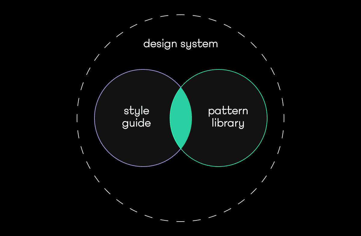
Deciphering the Design Landscape: Design Systems, Pattern Libraries, Style Guides
Start simple
If there's a solitary kernel of wisdom to glean from this discourse, let it be this: Pattern libraries and style guides are integral to the broader design systems. This nuanced comprehension could render the term "design library" virtually obsolete within this context.
Intriguingly, these realms aren't mutually exclusive; they often interweave harmoniously. For instance, icons frequently find their home within style guides, while pattern libraries encompass buttons bedecked with these icons. These elements' spheres of influence might not be rigidly defined, yet they tend to converge organically.
As the landscape of design systems, pattern libraries, and style guides unfolds, the interconnectedness of these concepts becomes strikingly apparent. They are symbiotic components, each contributing distinct yet interconnected layers to the art of design, culminating in a harmonious and comprehensive design ecosystem.
Let's dive deep even more
The essence of a Style Guide
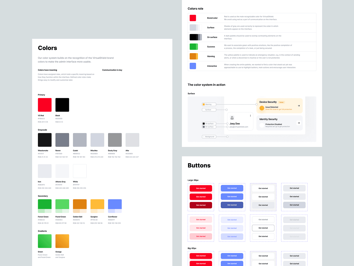
Within the realm of design, a style guide emerges as a pivotal document that encapsulates a spectrum of design guidelines pertinent to frequently recurring design elements. These encompass an array of constituents, ranging from the bedrock of visual identity components to the nuanced intricacies of icons, interface elements, and their myriad states. Whether the poised headings of visual aspect or the diverse states of interaction, a style guide leaves no stone unturned in its quest for design cohesiveness.
The narrative of a style guide typically unfolds after the high-fidelity wireframes stage has been traversed. This strategic timing enables a comprehensive envisioning of the requisite design elements. Subsequently, these elements are meticulously crafted and gradually assimilated into the structure of a style guide, which, in turn, can evolve into the broader framework of creating a design system.
Nestled within the confines of a style guide are an array of pivotal components. Typography, a quintessential cornerstone of design, finds its place alongside a symphony of icons, a variety of colors that paint the canvas of aesthetics, and the geometric shapes that underpin visual harmony. In the grand tapestry of design, even structural frameworks like grids find their home within this guide. Moreover, the branding elements, which constitute the essence of an entity's identity, seamlessly interlace within this comprehensive document.
A style guide functions as the compass guiding the design journey. It ushers a harmonious convergence of diverse design elements, orchestrating a symphony of visual unity.
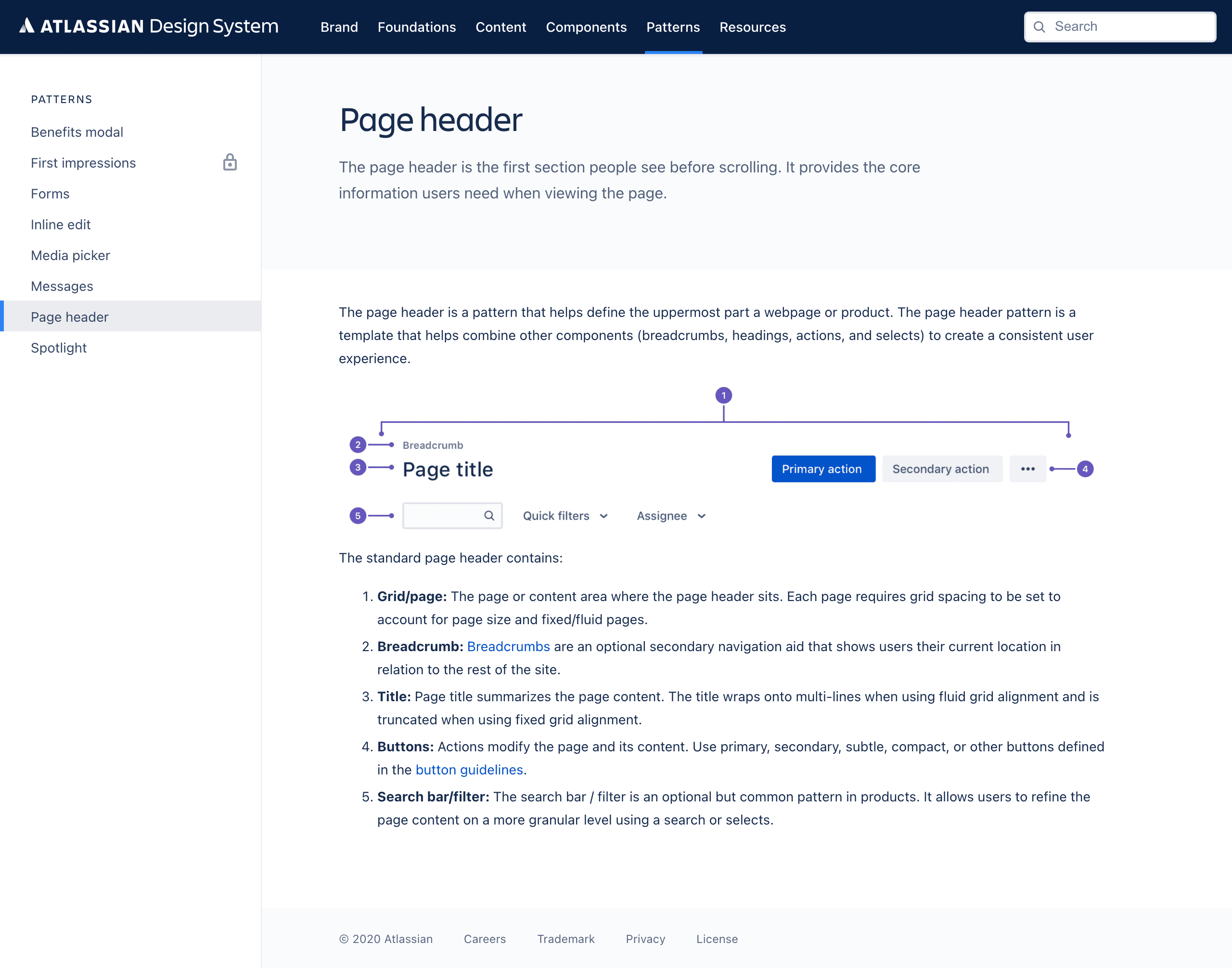
The essence of Pattern Libraries
Picture a pattern library as a treasury brimming with the wealth of reusable components in your application's architecture. This treasury encompasses a diverse assortment of elements design patterns; each handpicked for its potential to be repurposed across various aspects of your app's interface. The contents of this library embody the very DNA of your app's user experience, ensuring a consistent and harmonious journey for your users.
Dive into this trove, and you'll encounter an array of versatile elements, including but not limited to:
Carousels that elegantly showcase dynamic content.
Slideshows that weave narratives through images.
Social media features that foster seamless connections.
Navigational aids that steer users with grace.
Bridges to related content that deepen engagement.
And much more, all interwoven into a tapestry of usability.
Unlike the abstract nature that design systems sometimes take on, pattern libraries are the tangible manuscripts of your design endeavors. They encapsulate the visual essence and the potential for actual coding. Each element of component libraries stands as a testament to the thought and precision that goes into crafting user-centric interfaces.
In essence, a pattern library is the embodiment of practical design principles, a realm where usability meets creativity, and where efficiency thrives through the mastery of reuse.
Difference between design systems and pattern library
A design system encompasses various components, with a pattern library being one integral aspect content management systems. While the exact contents of a design system can be a topic of discussion, they generally encompass elements such as:
1. A collection of UI components presented in a pattern library.
2. Guidelines for branding and visual identity.
3. Instructions for maintaining consistent content style.
4. Defined design principles to follow.
5. A comprehensive service manual.
What is a Design System?
A design system represents an ongoing collection of design principles and reusable components. Within design systems, you'll find both style guides and pattern libraries. Beyond tangible design materials, these systems can also encompass conceptual assets like perspectives, common values, guiding principles to design systems, and more.
The constituents of design systems can be organized across various repositories. Tangible components are often stored within a dedicated file either within the project's directory or independently. On the other hand, the conceptual aspects can be documented in platforms such as Google Docs, Confluence, Miro, and similar tools.
Benefits of Using a Design System
Effectively implementing design systems can yield a multitude of advantages for design the development teams:
Streamlined Creation and Replication of Work:
Design systems excel in swiftly replicating designs through pre-existing UI components and elements. This practice eliminates the need to reinvent the wheel, promoting consistent design and minimizing unintentional disparities.Resource Focus on Complex Challenges:
Design resources are freed from continuous visual adjustments by employing reusable UI elements. This shift enables them to concentrate on intricate issues such as information hierarchy, workflow optimization, and journey management. This becomes especially impactful when coordinating efforts across numerous teams and countless screens.Establishment of Unified Language:
Design systems foster a shared language within and among cross-functional teams. This linguistic unity mitigates wasted time from communication gaps, ensuring that terms like "dropdown menu" retain specific definitions within the system.Ensuring Visual Consistency:
In scenarios where independent teams work in isolated silos, the absence of an overarching design system can lead to disjointed appearances and fragmented experiences. Design systems amalgamate components, patterns, and styles, bestowing visual cohesion upon diverse products, channels, and departments. Moreover, they facilitate comprehensive visual updates on a large scale.Educational Reference:
Design systems can double as educational tools for novice designers and content contributors. Explicit guidelines and style references aid newcomers in UI design and content creation while providing a useful reminder for experienced contributors.
By recognizing and capitalizing on these advantages, design teams can harness the full potential of design systems to enhance their development workflow and the overall quality of their work.
Considerations Against Using a Design System
Several potential challenges and constraints might deter a design team from adopting a design system:
Resource-Intensive Effort: Developing and sustaining a design system demands a substantial investment of time and effort, necessitating a dedicated team. Design systems are dynamic and continuously evolving to incorporate feedback from users. This ongoing commitment is crucial for their effectiveness.
Learning Curve for Implementation: Introducing a design system requires educating team members on its utilization. Even if the system is derived from an existing one, proper usage guidelines must be established. Neglecting this aspect could lead to inconsistent or erroneous application of the system across screens and teams.
Misalignment with Project Perception: A common misconception may arise that projects are self-contained and unique, not warranting the integration of reusable components. Whether accurate or not, this viewpoint can indicate a lack of cohesive strategy across projects and overlook the potential to enhance efficiency.
Recognizing these potential challenges helps design teams make informed decisions about adopting a design system, considering the resources required, the learning curve, and the alignment of design efforts with project goals.
Examples of Design systems
Google Material Design System
Google's Design System is one of the most widely recognized design systems. Google has generously shared its comprehensive Material Design System, delving into every intricate facet of own design system and its underlying principles. Among the beneficiaries, UXPin users can seamlessly access and incorporate Design System components directly from the UXPin libraries.
This system is an invaluable resource, harmonizing UI and UX aspects across diverse devices, platforms, and input methods. Notably, Material Design extends its influence beyond Google's own realm, providing a robust groundwork for other brands and individuals to build upon. This encompasses approaches to atomic design, industry advancements, and articulating unique brand values and identities.
Key Attributes of Material Design System Encompass:
Starter Kits
Design Source Files
Material Theming
Layout
Typography
Color
Components
Mobile Guidelines
Google's Material Design System emanates a sense of maturity. Its comprehensive assortment of design guidelines coexists harmoniously with detailed documentation of all the elements and UI components employed in development. This amalgamation creates a rich and versatile resource that facilitates both visual consistency and practical implementation.
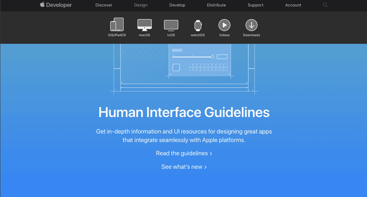
Apple Human Interface Guidelines
Apple is at the forefront of design systems, boasting one of the most distinguished examples: the Apple Human Interface Guidelines. This remarkable resource offers an expansive and valuable repository for web design essentials, pattern libraries, and downloadable templates. Notably, the iOS UI kit library is also at the disposal of those with a UXPin account.
This system ardently adheres to the design principles espoused by Steve Jobs:
Meticulous Craftsmanship: Every detail is meticulously executed with precision.
User-Centric Focus: Prioritizing user experience and fostering meaningful connections with users.
Strategic Emphasis: Concentrating on the truly essential aspects on a larger scale.
Desired Responses: Harnessing a unique design language and methodologies to elicit desired user reactions.
User-Friendly High Tech: Balancing approachability for novices and the advanced capabilities of technology.
Elegance Through Simplicity: Streamlining complexities to achieve elegant solutions.
The Apple Human Interface Guidelines offer a wealth of practical resources, visual directives, and style guides, catering to both designers and developers across iOS, macOS, watchOS, and vOS platforms.
This encompassing resource covers the design and development teams and system documentation on a range of topics, including:
Menus
Buttons
Icons and Images
Fields and Labels
Windows and Views
Touch Bar
Indicators
Selectors
Extensions
Visual Design
Visual Index
App Architecture
System Capabilities
User Interaction
Themes
By adhering to these comprehensive guidelines, Apple's design system maintains a consistent and iconic aesthetic and offers a foundation for creating seamless and consistent user experiences well-centered experiences.
Polaris Design System
Shopify is a global eCommerce platform offering an all-inclusive suite digital products for brands seeking to manage and expand their businesses seamlessly.
Given its comprehensive scope, it's no surprise that Shopify's design principles revolve around enhancing and democratizing the commerce experience.
At the heart of Shopify's approach is its public design system, Polaris, which beautifully encapsulates the company's fundamental values:
User-Centric Care: Prioritizing user well-being and considerations.
Empowering Tools: Equipping individuals with the precise tools they need to achieve their goals.
Craftsmanship Excellence: Exemplifying top-tier craftsmanship that aligns with the brand's essence.
Effortless Solutions: Streamlining processes by furnishing swift and accurate problem-solving avenues.
Trust-Based Development: Continuously building upon users' trust and confidence.
Comfortable Engagement: Cultivating a sense of ease and familiarity in user interactions.
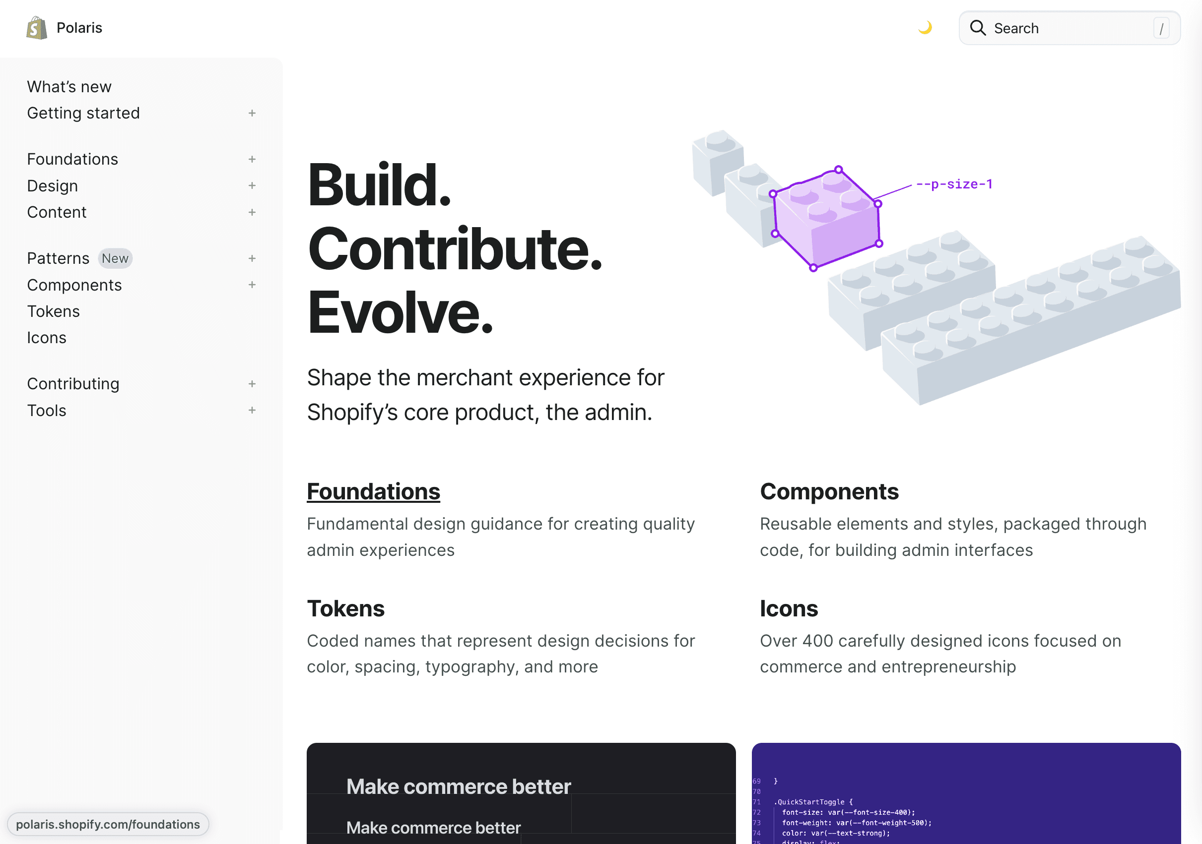
Shopify's Design System is a user-friendly and pragmatic style guide tailored for designing within the Shopify ecosystem. It furnishes an expansive knowledge base encompassing UI components, visual elements, content strategies, and design language, all geared towards fostering enhanced and consistent user experience, experiences and product excellence.
The Shopify Design System, Polaris, seamlessly integrates the principles above into its core features:
Data Visualization
Accessibility
Interaction States
Colors
Typography
Icons
Illustrations
Spacing
Sounds
Resources
By adhering to Polaris, Shopify augments its platform's usability and fortifies its commitment to delivering exceptional eCommerce journeys for its users.
Conclusion
In the dynamic landscape of digital design, the concepts of design libraries, design systems, pattern libraries, and style guides play pivotal roles in achieving consistency, efficiency, and user-centered excellence. These interconnected components provide the infrastructure for streamlined development, fostering harmonious visual experiences that transcend devices, platforms, and interactions.
From Google's Material Design System to Apple's Human Interface Guidelines and Shopify's Polaris Design System, industry leaders have pioneered approaches that encapsulate design principles, reusable components, and comprehensive guidelines. These systems aren't just about aesthetics; they signify a commitment to elevating user interactions, enabling innovation, and fostering seamless collaboration across design and development teams.
By recognizing the synergy between these elements, we embark on a journey to craft digital landscapes that resonate with users, simplify processes, and set the stage for exceptional experiences. Whether through standardized UI components, visual harmony, or cohesive brand expressions, the exploration of design libraries and systems is an essential voyage in the pursuit of design excellence.
© 2024, Baked Design
Baked with ❤️ and dedication!