onetwenty
A calm home for your health data
- Project
- Brand, web app, mobile, design system
- Deliverables
- Branding, Product design, Web app
More on brand identity and product design
“Excited to see these incredible designs and what the final state looks like”
Introduction
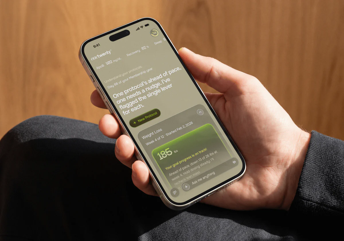
onetwenty is a longevity membership. Members see their biomarkers, wearable data and protocols in one place, talk to an AI coach, and order bloodwork, medications, peptides, vitamin packs and scans from a marketplace.
Baked redesigned the web app, laid out the mobile flows, wrote a brand guideline and built a design system for the team, in about six weeks.
What is the maximal user benefit we can extract from a minimal UI?
Direction
Colour that still feels calm
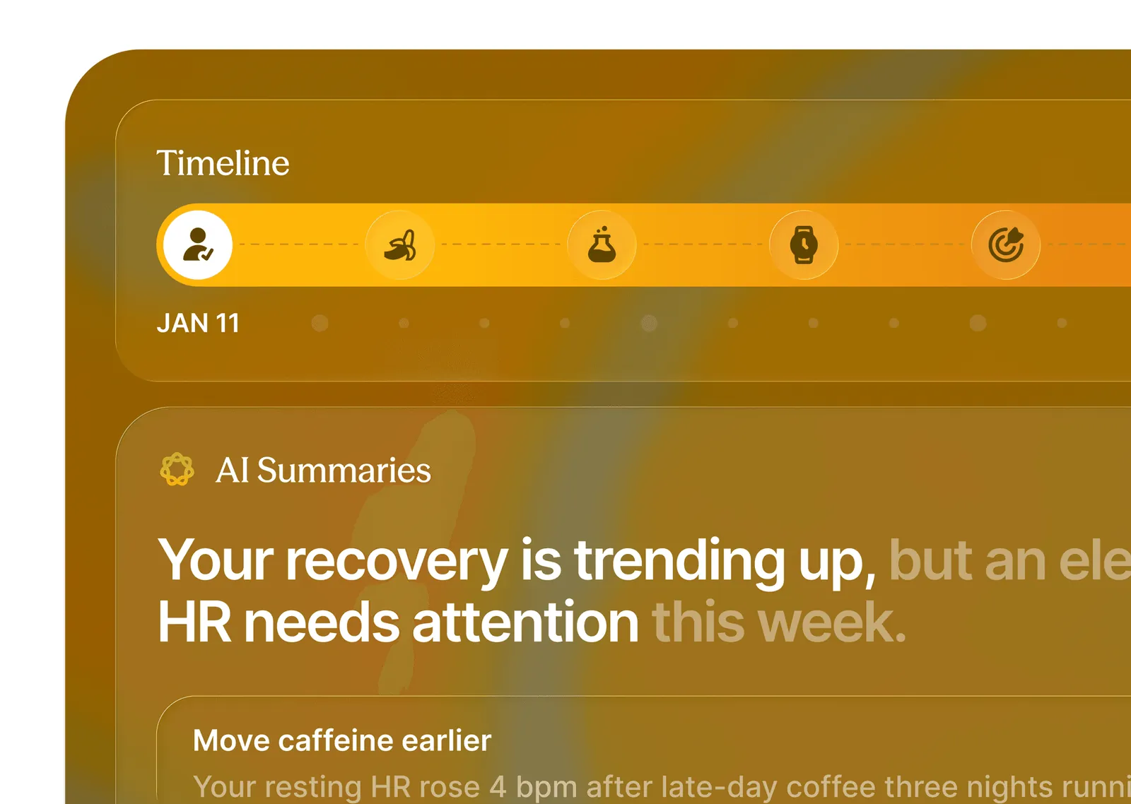
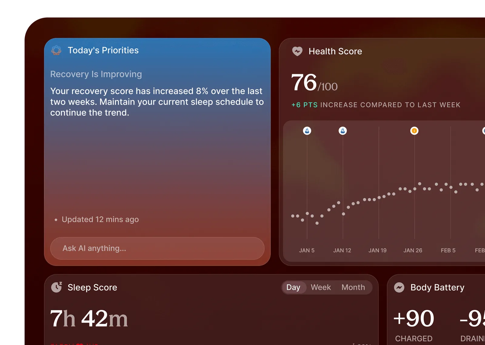
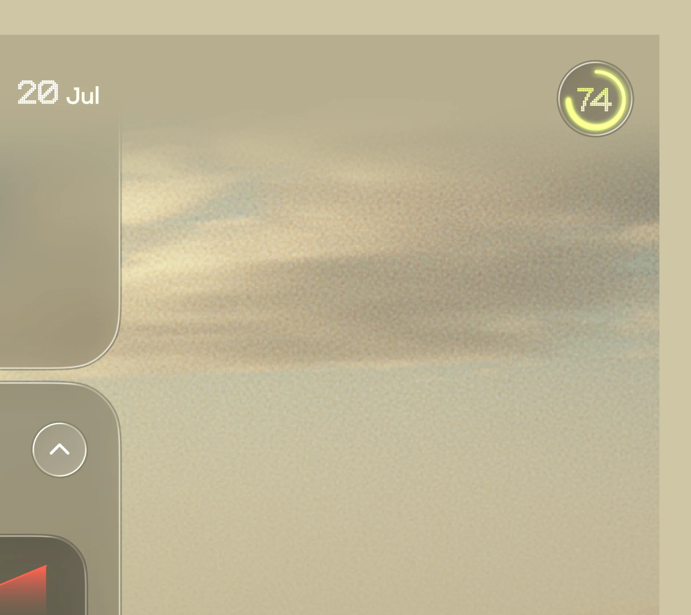
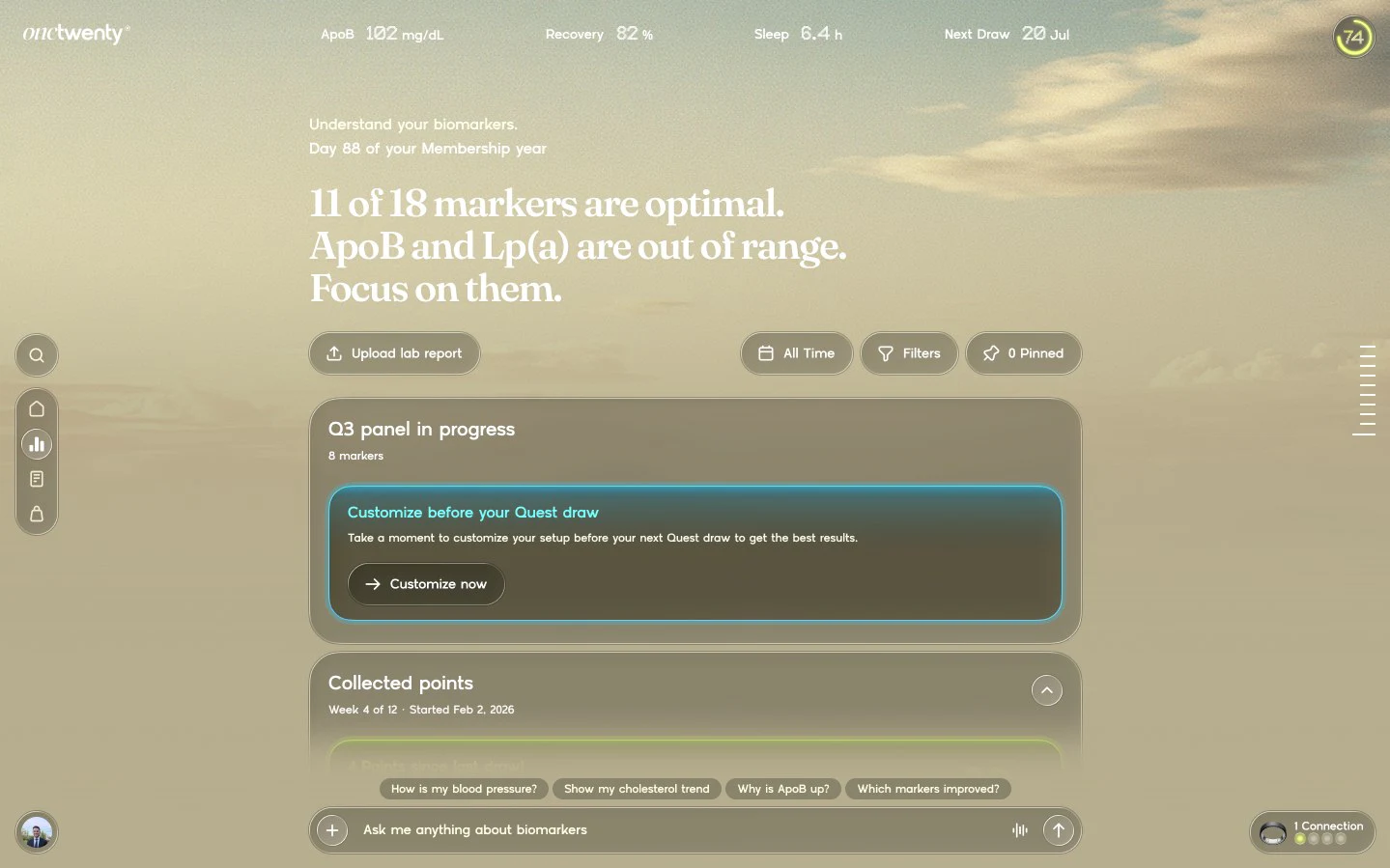
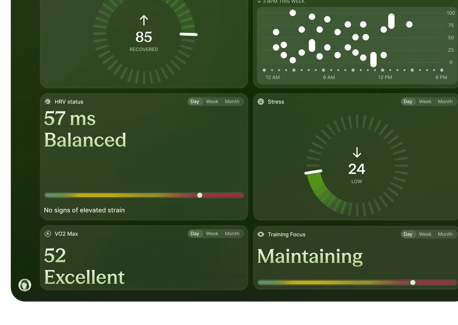
We started with vibrant themes and data cards. The team asked to tone it down for members aged 40 to 60, so we moved to a soft sky background with one lime accent for progress.
“Hey Nick, we just finished our review and are very happy with the direction.”
Web app
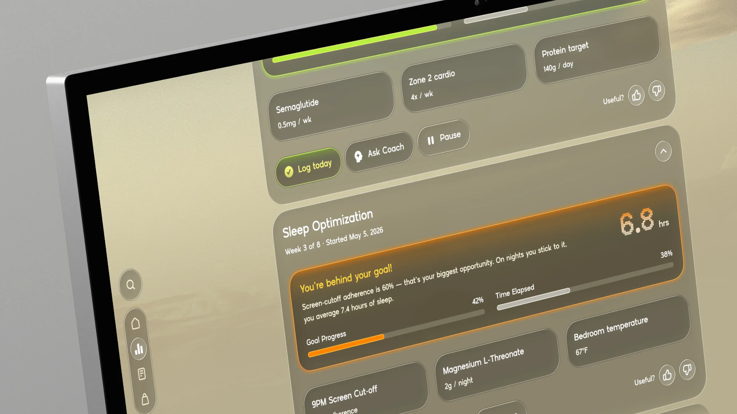
Home, protocols and biomarkers
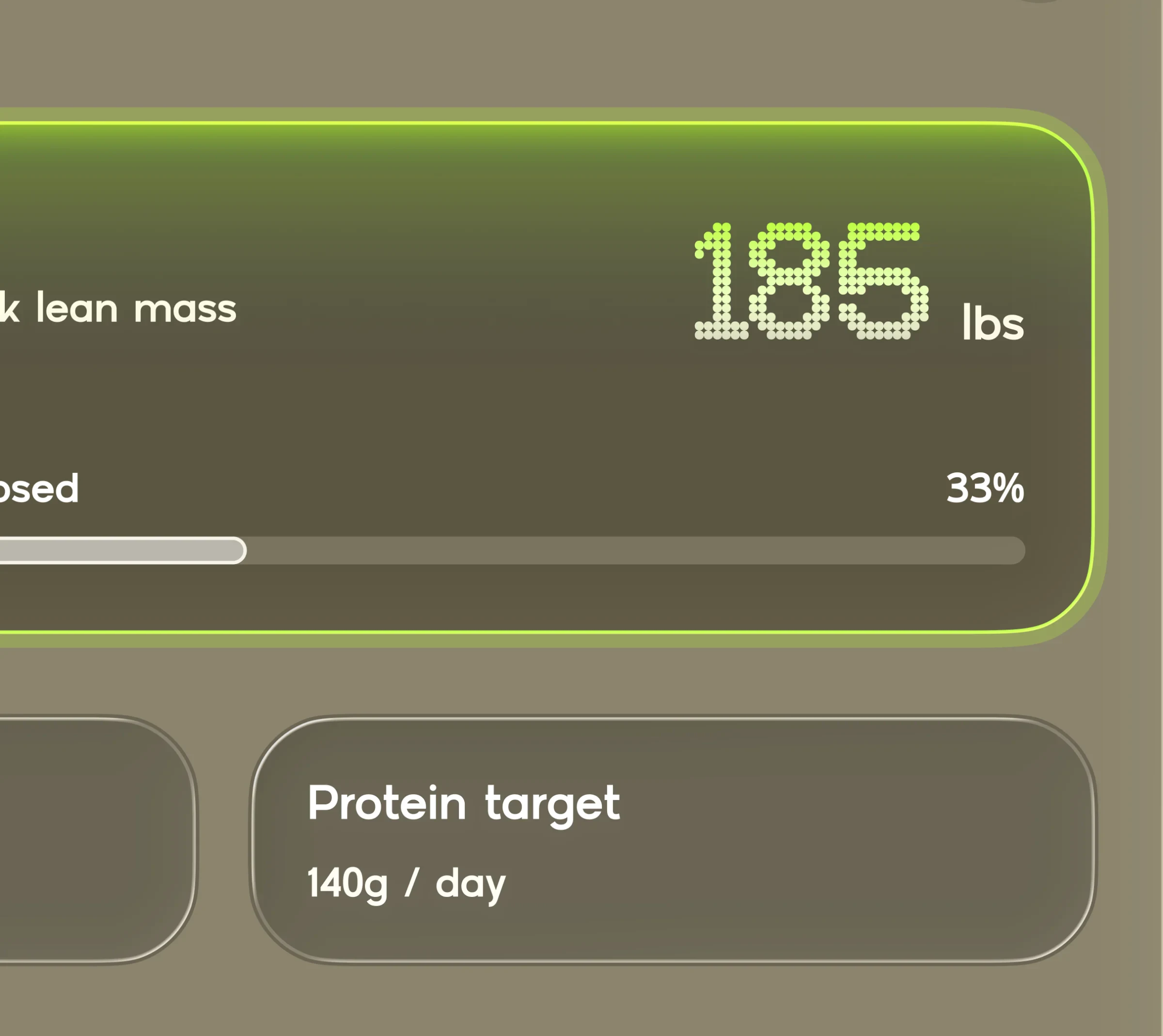
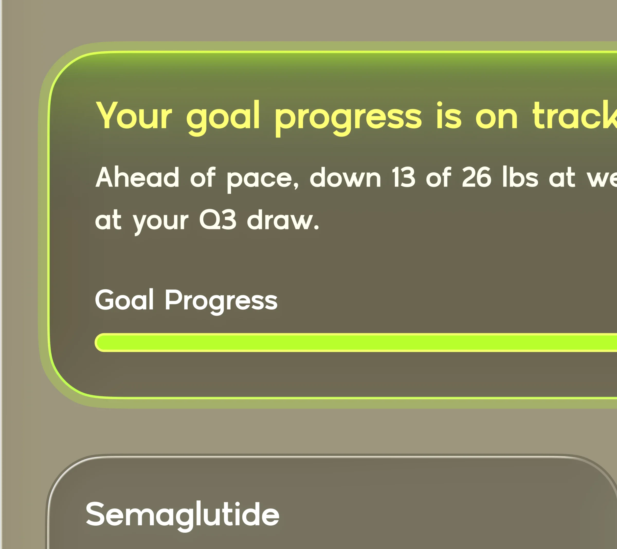
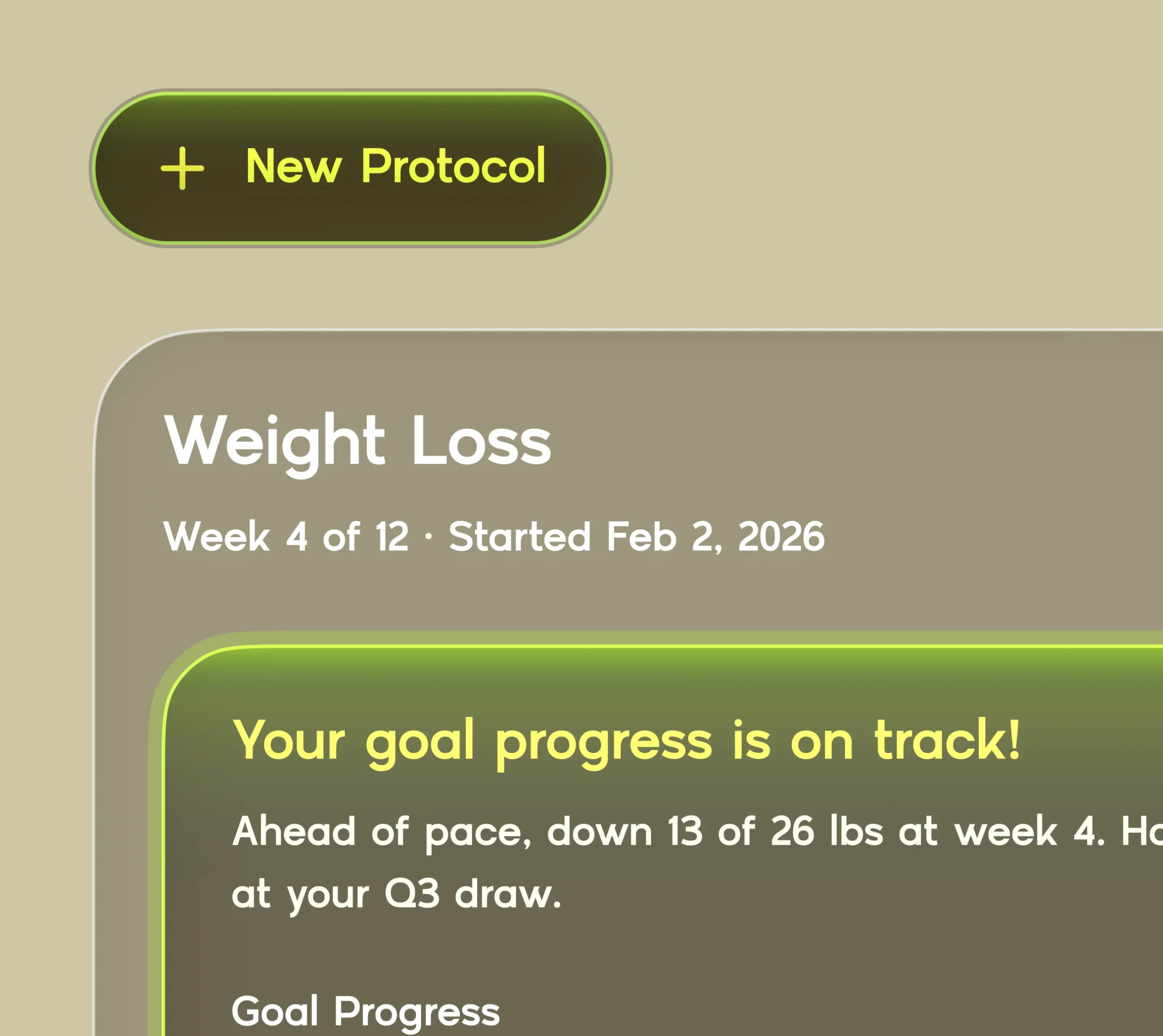
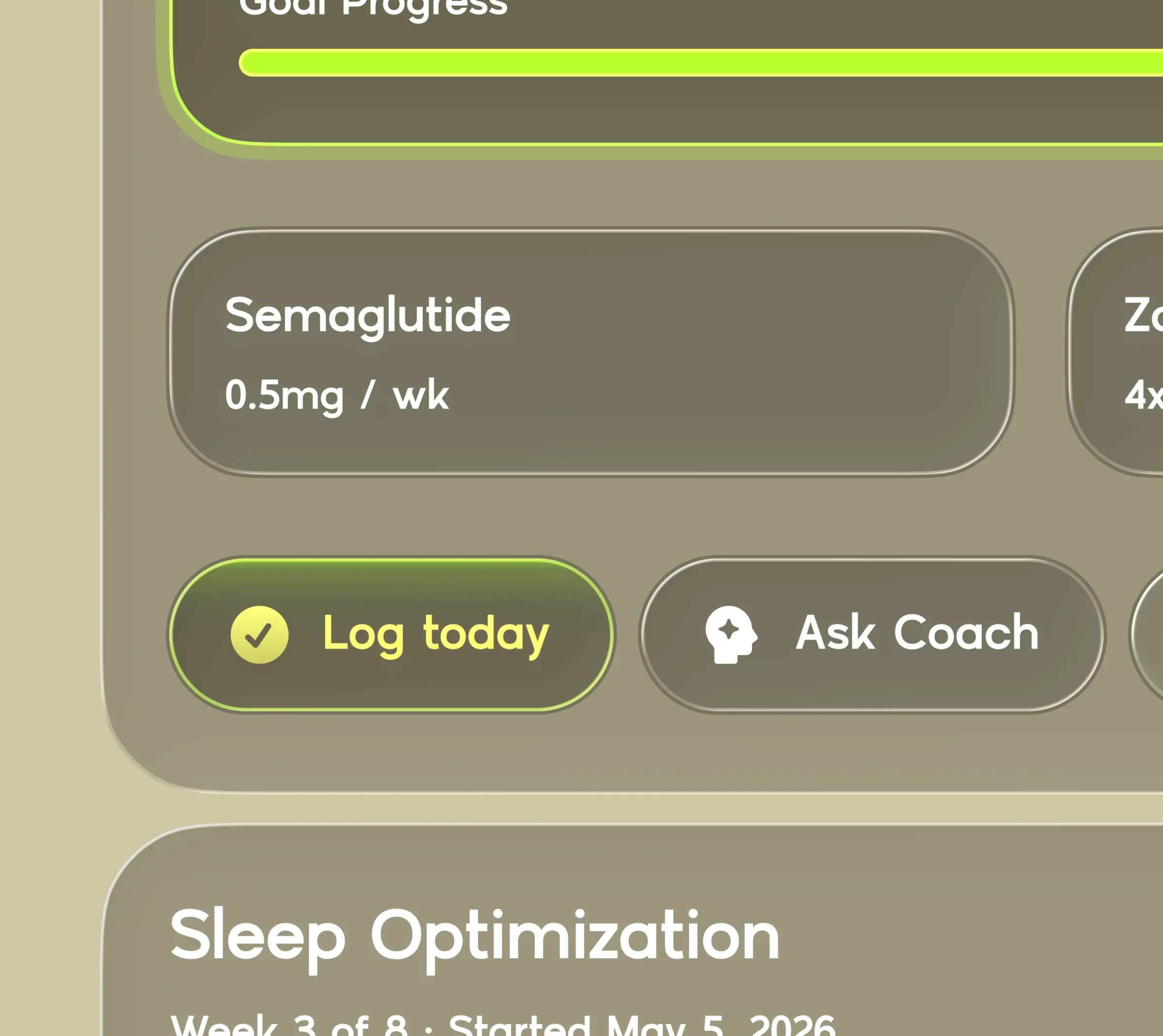
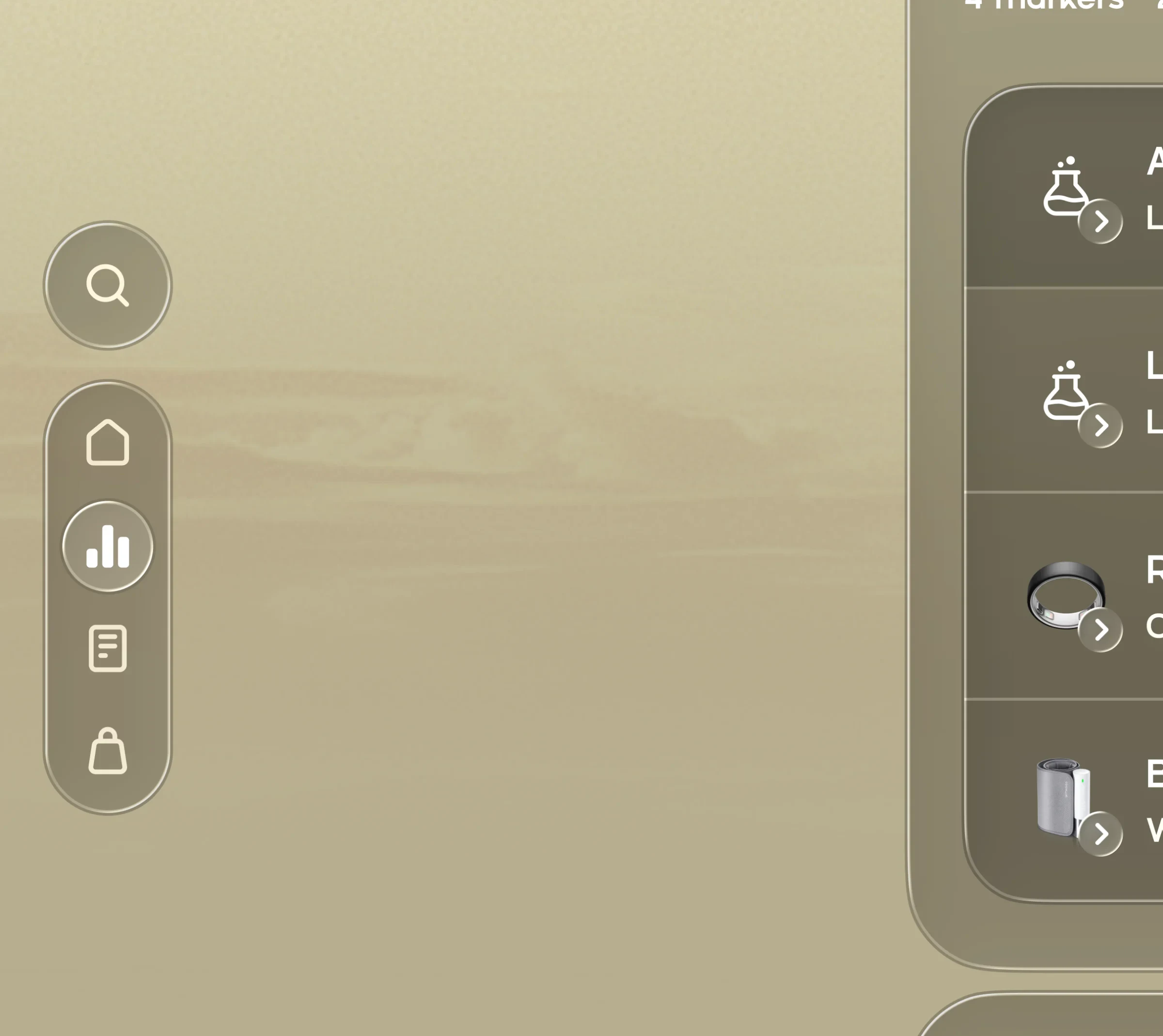
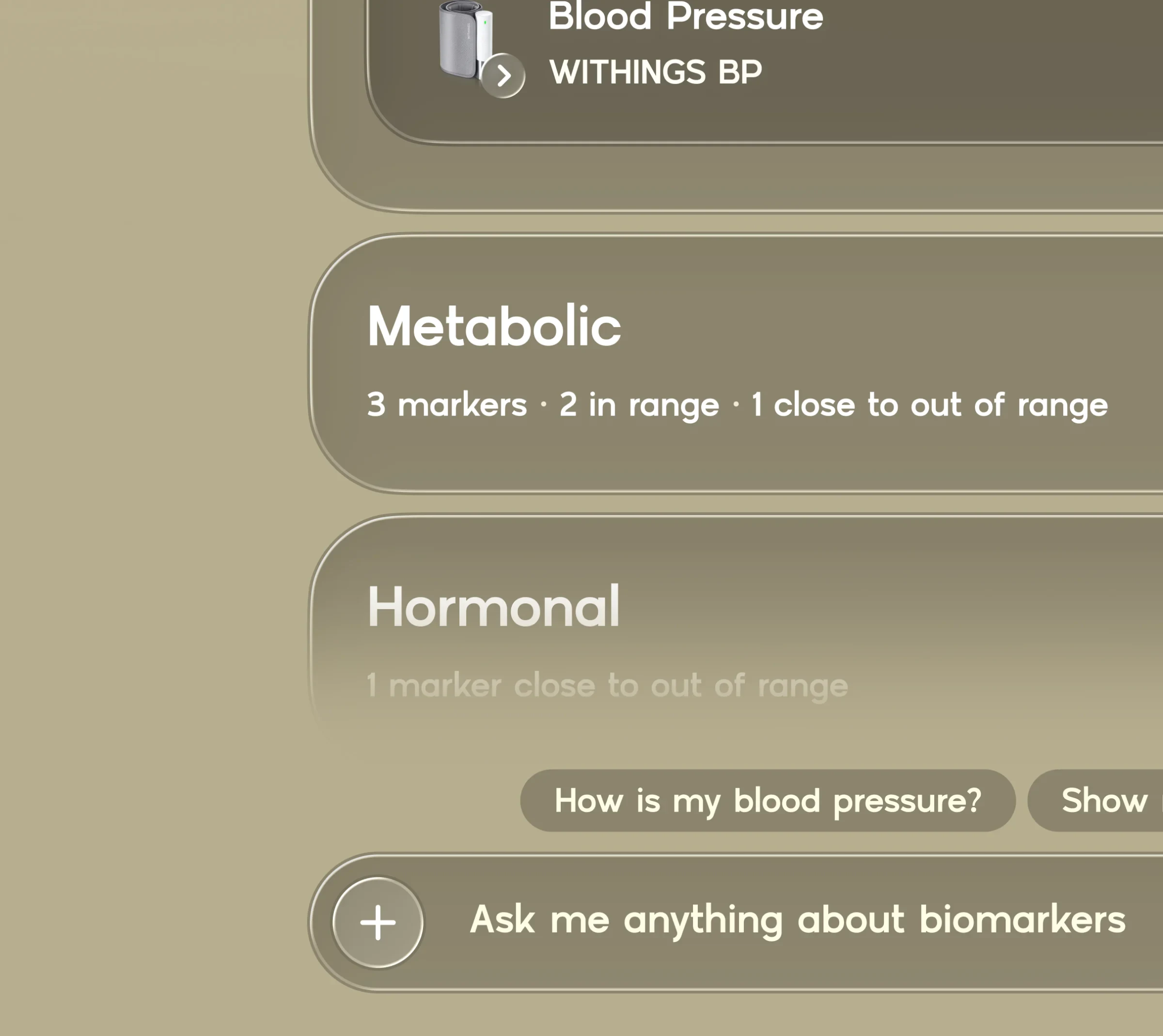
Each page opens with a plain sentence about your data, then the cards that matter. Chat sits at the bottom of every screen so you can ask about any number.
“Excited to see these incredible designs and what the final state looks like”
Details
Built for readability
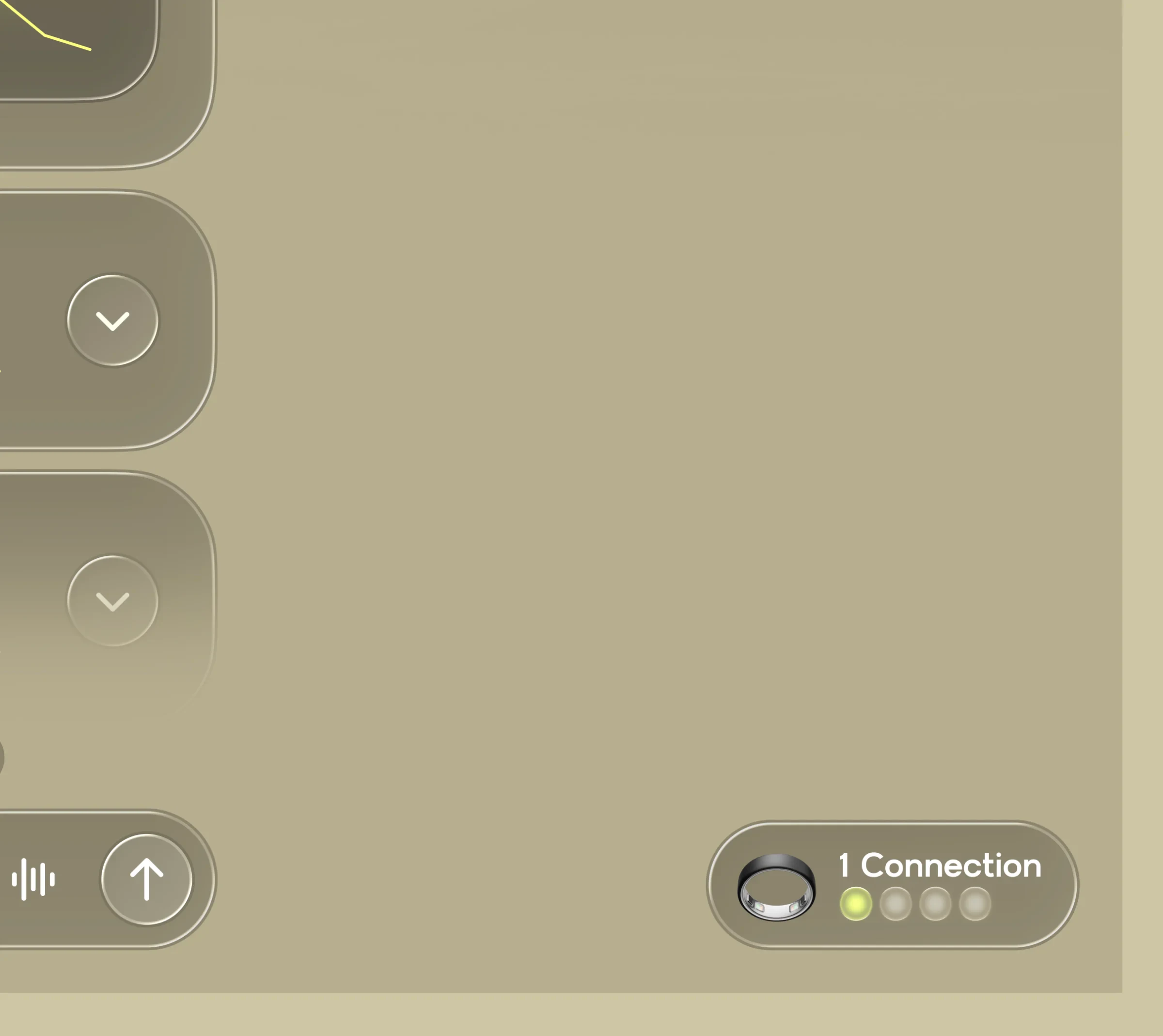
We raised the smallest text from 12px to 14px after feedback that older members would struggle to read it. Lab and device data get their own clear lists.
Marketplace and mobile
Shop and take it with you
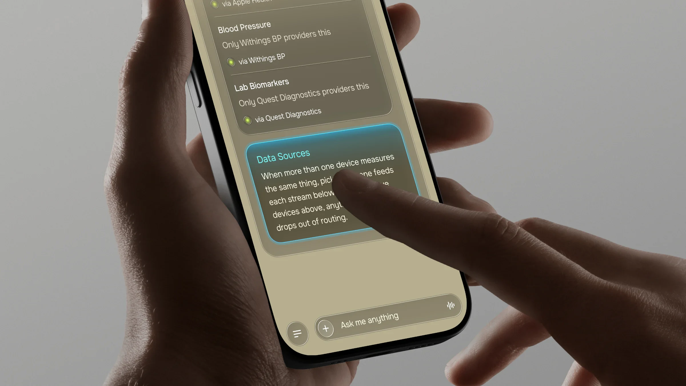
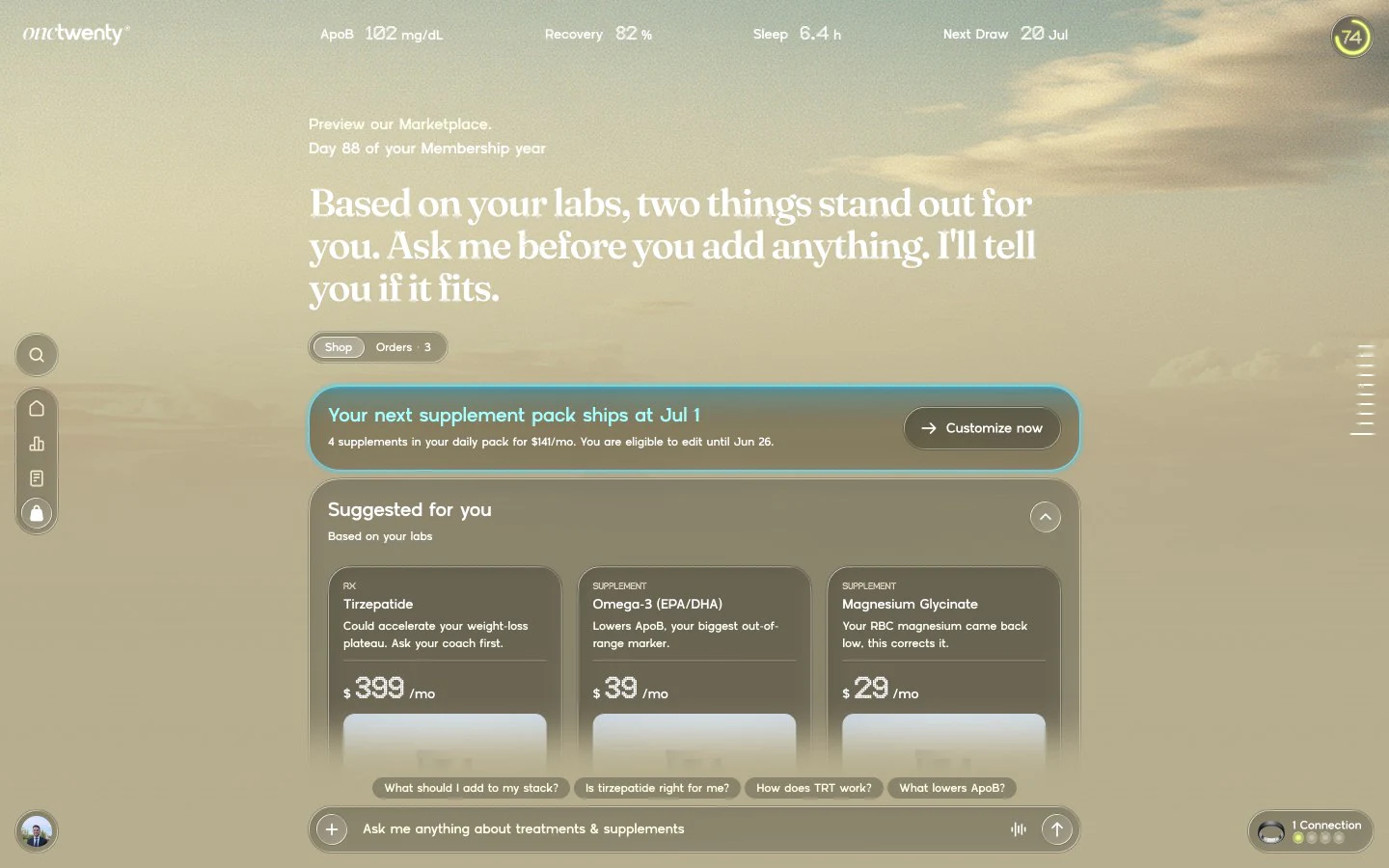
The marketplace suggests products based on your labs, with a custom pack builder and an orders tab. Mobile layouts cover the same flows.
Brand
A brand guideline and system
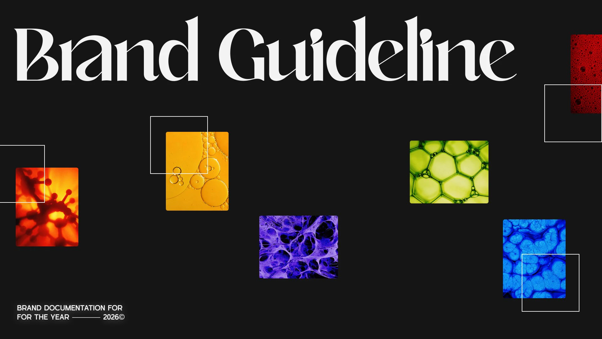
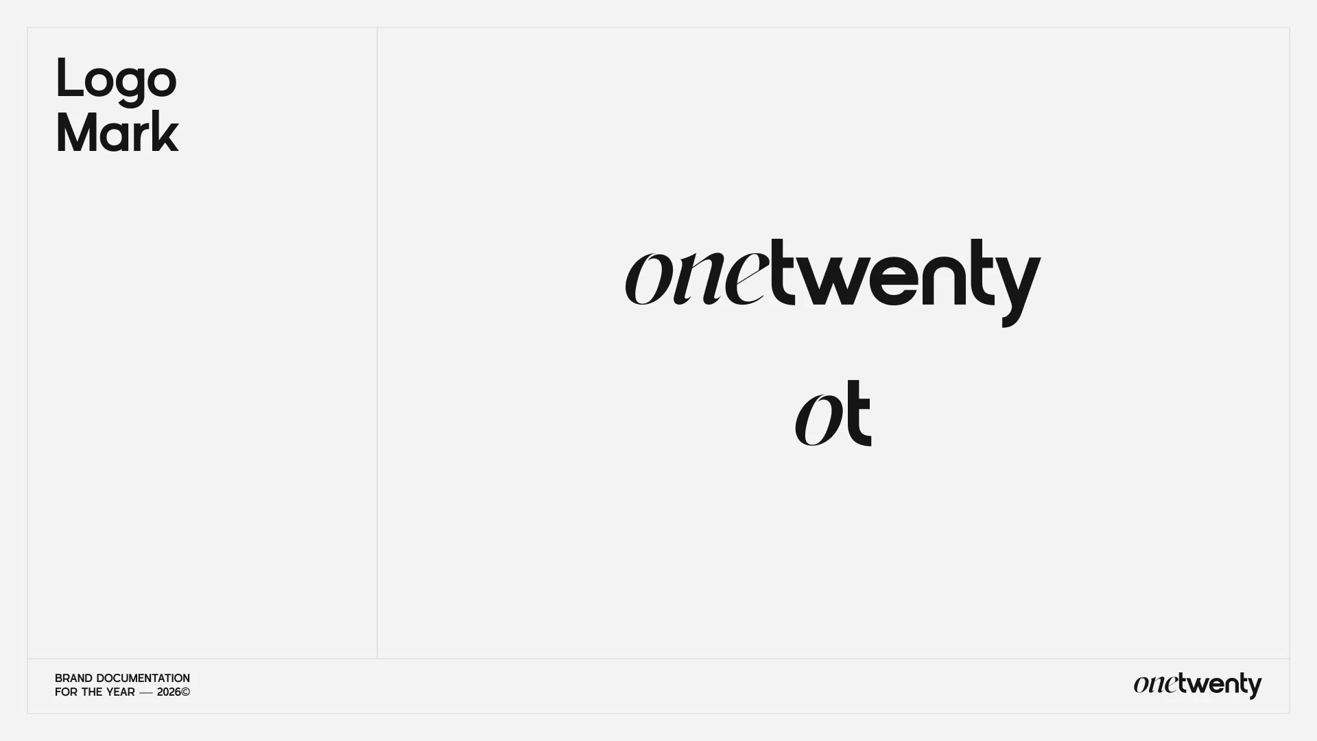
We wrote a brand guideline with logo, colour, type and imagery rules, then a component library with colour tokens, grids and icons for the team to build against.
“Here is my loom feedback, really great start.”
Want work like this for your startup? Send a request in Slack and it is ready to review in days.